Accessible colours beat Solarized (and why that matters)
A friend commented on my recent accessibility improvements: “Do those tools check for color blindness accessibility too? I’m strongly colorblind and your red headings on a dark background, particularly the smaller ones, are near the edge of readability for me.”
Ouch. I prefer light mode these days and had completely neglected dark mode during my accessibility upgrade. To my embarrassment, I’d fixed light mode contrast but left dark mode users, especially those with colourblindness, struggling.
Time to fix it properly. I researched accessible colour schemes, replaced my Solarised-inspired palette with Material Design 3 colours tuned to meet WCAG AA/AAA contrast ratios (that’s a 4.5:1 ratio for normal text, 3:1 for large text, basically ensuring text is dark enough on light backgrounds, or light enough on dark ones), and added automated checks to prevent future regressions.
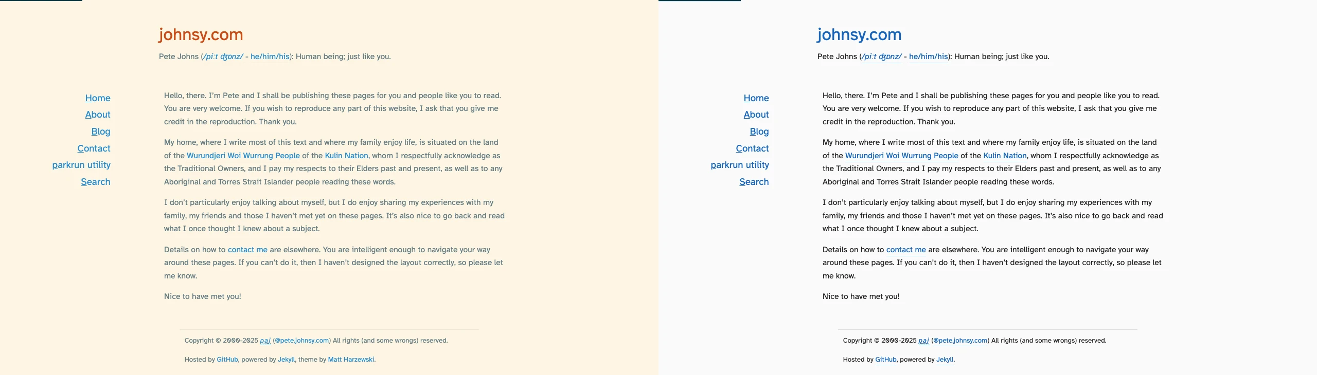
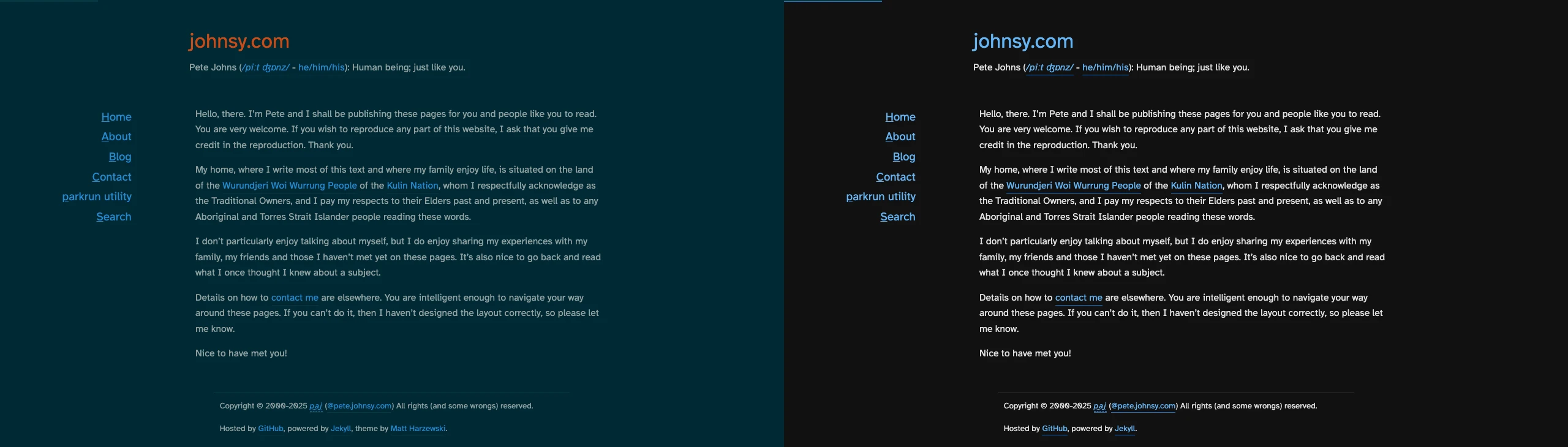
# What changed
Colour palette overhaul
I replaced the Solarised-inspired palette with Material Design 3 colours that meet WCAG AA contrast requirements. The new palette works in both light and dark modes and is safer for colourblind users.
Key fixes for dark mode:
- Headings now have sufficient contrast against the dark background
- Muted text uses lighter shades that remain legible
- Links keep their underline/border styling so they remain identifiable without depending only on colour
Light mode got attention too:
- Muted text darkened for better contrast with metadata and search excerpts.
Automated accessibility testing
To prevent regressions, I expanded Lighthouse CI coverage to test both light and dark modes across all main pages (/, about, blog, contact). The configuration forces prefers-color-scheme for each run and enforces accessibility and colour-contrast audits. Now every commit gets checked automatically.
There’s more to do on a few sub-sites, but publishing the current improvements early invites feedback and keeps future fixes small. If you spot anything awkward to read, please get in touch.
I also created a comprehensive style test page that exercises every CSS colour combination used across the site—headings, body text, links, code blocks, metadata, search results, and more. This page is included in the Lighthouse accessibility audits (but excluded from performance/SEO checks since it’s intentionally dense). This is only intended for testing, and is not deployed. You can verify the live site’s accessibility using tools like WAVE or axe DevTools.
# Lessons learned
-
Test both modes: I focused on light mode because that’s what I use daily, but half my visitors might prefer dark mode. Accessibility means everyone.
-
Colourblindness matters: WCAG contrast ratios help, but they’re not the whole story. Red on dark backgrounds can be particularly problematic for deuteranopia and protanopia (the most common types). Tools like Who Can Use help visualise how colours appear to different users.
-
Automate the checks: Manual testing catches obvious issues, but automated CI prevents regressions. Lighthouse CI with forced colour schemes ensures both modes stay accessible.
-
Performance comes along for the ride: Fixing accessibility often improves performance too. Minifying CSS and using media queries for palette files reduced render-blocking by half.
Solarised remains a favourite for my terminal and code editor, but for public web content, Material Design 3’s accessible palette is the better choice.
# On design and evolution
I don’t consider myself a designer (I’d probably make a better drummer) but this is now the fourth colour scheme this website has had since its inception over 20 years ago. This iteration reinforced the importance of contrast, restraint, and how accessibility constraints often lead to better design decisions.
If you spot anything that still feels hard to read, especially in dark mode, please let me know and I’ll adjust it.