Switching to Atkinson Hyperlegible
I’ve updated this website to use Atkinson Hyperlegible as the default typeface, with Atkinson Hyperlegible Mono for code blocks. This change was inspired by reading the most recent Better Allies newsletter, which highlighted this free typeface from the Braille Institute.
As I’ve mentioned before, I get a lot of value from the Better Allies newsletter. Each week, Karen Catlin shares five actionable tips on inclusion, and I’ve learned a great deal from it. The newsletter’s October 31, 2025 edition included a section on using hyperlegible fonts, which caught my attention.
Atkinson Hyperlegible is specifically designed to increase character recognition, which improves readability for low-vision readers. The font is named after Braille Institute founder J. Robert Atkinson and is completely free to use.
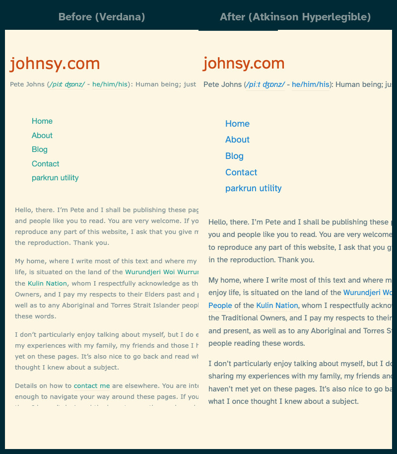
The change was straightforward to implement. I added the Google Fonts links for both the regular and monospace variants, updated the font-family declarations in the CSS, and adjusted the font sizes slightly (from 13px to 15px) to maintain good readability given that Atkinson Hyperlegible is more condensed than the previous Verdana font. I also increased the heading sizes proportionally to maintain the visual hierarchy.
And while I was there, I consulted Lighthouse and made a few additional accessibility tweaks. Sometimes the smallest changes can make a big difference in accessibility. Using a hyperlegible font is a simple way to make content more accessible to low-vision readers, and it can be something that benefits everyone.